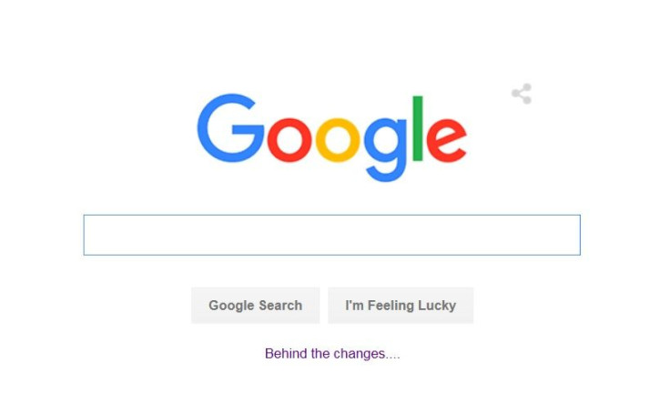
Google (GOOG) Just Gave The Internet's Most Visited Web Page A Facelift

Google just tweaked one of the world's most valuable logos on the most visible page on the Internet. That's the Google logo itself, naturally.
On Tuesday, Google took the wraps off its new logo, which does away with the serif font and flattens out the look, removing shadows, much like Apple did with its mobile and desktop operating systems and apps last year.
With upwards of 250 million U.S. visitors a month, Google.com is the front door to more than $45 billion in annual search ad revenue, so any change to the search page is subject to significant testing and rigor.
In a blog post, Tamar Yehoshua, VP, product management, and Bobby Nath, director of user experience, explained their rationale: "Users now engage with Google using a constellation of devices, and our brand should express the same simplicity and delight they expect from our homepage, while fully embracing the opportunities offered by each new device and surface."
In a style similar to the new Android Marshmallow boot logo, Google introduced the logo with bouncy animation. Jean-Marc Denis, Google's senior interaction designer, shared the new logo on Twitter.
New Google logo - More accessible and useful to people across more devices and platforms https://t.co/kLBNqNp0z7 pic.twitter.com/wdp4HL6zp7
— Jean-Marc Denis (@jm_denis) September 1, 2015Google's new parent company, Alphabet, also recently unveiled its logo. The introduction of Alphabet took the tech industry by surprise, with no leak prior to the announcement. Google's new logo, with its sans serif font, more closely matches the Alphabet aesthetic.
Google also unveiled a Google doodle on its homepage; it wipes away the old logo and draws the new one in with crayon. The animation is unlikely to dispel any ideas among the public that the logo is still just as basic and childish, but it continues the long-standing tradition of Google marking significant events with new animation on its homepage.
© Copyright IBTimes 2024. All rights reserved.


