Rape Infographic Stirs Debate Over False-Accusations Myth

An infographic that purports to break down disturbing rape statistics went viral on Monday, but not everyone is buying it.
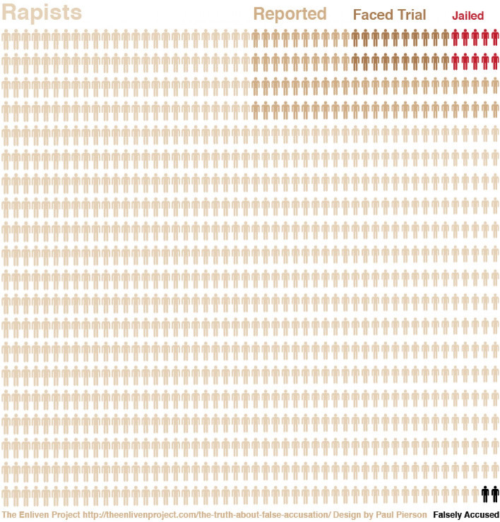
The graphic was created by the Enliven Project, an online campaign designed to spread awareness about sexual violence in the United States. It was compiled, Enliven Project Says, with statistics from the Department of Justice’s National Crime Victimization Survey and FBI reports. In it, the Project illustrates a troubling reality in which very few rapes are actually reported. Of those that are reported, fewer still are prosecuted and only a tiny percentage of perpetrators ever face jail time.
Perhaps even more eye-opening is the graphic’s illustration of how few reported rapes turn out to be false accusations -- a mere two out of every 100 rapes, according to the graphic. The image dispels the myth that a high number of reported rapes are in fact consensual, an argument often put forth by those who oppose tougher laws to protect victims and swifter justice for offenders.
The infographic was shared profusely on Twitter early this week and ultimately found its way into the hands of some major media outlets. The Washington Post’s Dylan Matthews re-posted it on Monday afternoon under the headline, “The saddest graph you’ll see today.” Over at Jezebel, Katie J.M. Baker did the same, suggesting that her readers “Show This Depressing Graph to the Rape Apologist in Your Life.”
But Slate’s Amanda Marcotte wrote on Tuesday that the well-intentioned graphic is confusing the issue. Among Marcotte’s concerns is that the graphic actually overestimates the number of falsely accused rapists by conflating “false accusations” with “false reports.” The former requires the victim to identify a perpetrator while the latter only requires the victim to report the crime itself.
Marcotte also thought the graphic -- which illustrates each rape with a male-shaped icon -- was visually misleading in that it leads the viewer to assume one rapist per rape. “Your average rapist stacks up six victims,” she wrote. “That’s hard to capture in an infographic, but could be clearer by just labeling the little dudes “rapes” instead of “rapists.”
The Enliven Project, for its part, addressed the challenges of collecting rape statistics in a separate blog post by its founder, Sarah Beaulieu, who acknowledged that the infographic isn’t perfect. “One of the key challenges about sexual assault statistics is that it’s nearly impossible to gather accurate and consistent data about incidence and prevalence,” Beaulieu wrote.
Beaulieu responded to some of the questions about the infographic by posting the statistics she used and links to their original sources. While there are some inconsistencies, the data is disturbing no matter how you look at it. You can read the full list here.
The Enliven Project’s infographic was posted in the wake of two high-profile rape cases that are bringing much-needed awareness to the issue of sexual violence around the world. In India, a 23-year-old medical student died last month after being brutally gang-raped on a Delhi bus. And in Steubenville, Ohio, two members of a local high school football team are being accused of kidnapping and raping a 16-year-old student. Both incidents have sparked massive national protests.

© Copyright IBTimes 2024. All rights reserved.


