Airbnb Adds 'Travel Porn,' Hopes You'll Become Addicted

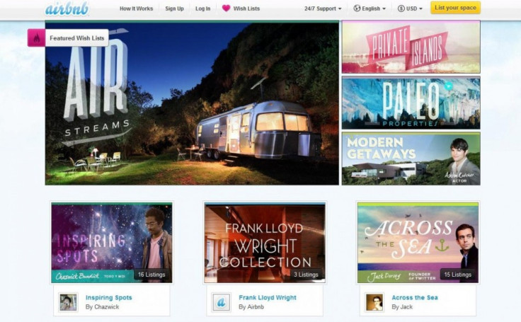
Go to Airbnb.com Wednesday and you'll notice that the site looks a lot more like a Tumblr page for, say, Architectural Digest than a travel booking engine. Of course, that's the point. With Airbnb 2.0, as some are calling it, the crowdsourced room rental service hopes to engage its users by selling the fantasy of travel, offering us free travel porn and hoping we'll become addicted.
A new Wish Lists function -- which replaces Favorites (a tool few users took advantage of) -- is at the center of the redesign. It works like this: Say you're on the couch dreaming about where you want to go in the future. The destination could be anywhere, and the date really isn't important. In this bucket list meets Pinterest concept, you simply explore new places, discover friends' favorite listings, post Wish Lists to Facebook and plan dream trips -- no matter the distance, cost or feasibility.
Somewhere along the line, Airbnb hopes that you'll actually purchase that dream rental, but Wish Lists are really just a way of making the experience more social and visual -- a way to get you to spend your free time on the company's website and become the curator of your own fantasy.
We thought deeply about how sharing not only empowers trips, but also fuels discovery and inspiration, said Joe Gebbia, co-founder and CPO. Where else can users build their own aspirational lists that contain Frank Lloyd Wright architecture, the iconic Tower of London and castles owned by the Borges family? With Wish Lists, we've not only transformed Airbnb to illustrate our passion for design, we've woven social into this product from the ground up, so discovering, creating and sharing Wish Lists is a simple, sleek experience for users.
The San Francisco-based startup has seen a rapid expansion in its four short years on the Web, just last week hitting 10 million guest nights booked. Having reached critical mass, the new functionality is seen as a way to move beyond the basics of simply booking a short-term rental by creating a community of travel enthusiasts. It's a way to make booking a night away a little less routine and a lot more joyful.
The new site design and iPhone app allow users to navigate lists of popular destinations, editorially curated content and lodgings their friends like.
To make the site more alluring, Airbnb commissioned photographers to capture the essence of its properties. According to Airbnb CEO Brian Chesky, shutterbugs have now shot more than a million images, creating one of the largest collections of interior design photos in the world.
The open-ended scroll on the main page allows users to browse through (and ogle at) locations ad infinitum. Going deeper, listings are organized around curated lists from the Airbnb staff and tastemakers like Yves Behar, Jack Dorsey and Airbnb investor Ashton Kutcher. There are also pages that list popular properties including igloos, caves, and private islands from Airbnb's collection of rentals in roughly 19,000 cities and 192 countries.
Moving away from the search paradigm and toward one of exploration, Airbnb hopes to make the website more like the travel experience itself. But will the model work to boost sales? It's hard to say, but it's certainly getting rave reviews for its glossy new look.
© Copyright IBTimes 2024. All rights reserved.


