Apple iOS 7: New Features Dazzle At WWDC 2013, Designed To 'Bring Order To Complexity' [PHOTOS]
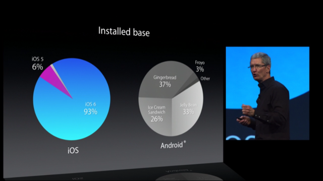
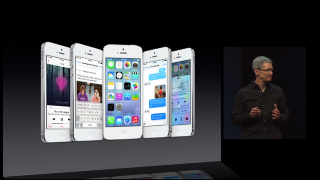
At its 2013 Worldwide Developers Conference on Monday, Apple CEO Tim Cook introduced the latest version of Apple’s mobile operating system for iPhone, iPad and iPod Touch, called iOS 7. Cook said iOS has helped Apple sell more than 600 million iDevices and earn a 97 percent satisfaction rate among users surveyed, but he also acknowledged that iOS’s success is largely due to the number of updates that are quickly and easily distributed. Comparatively, Cook described how about a third of users are using the latest version of Android, and that iPhone users spend 50 percent more time on their phones compared to Android users. With that, he moved the conversation back to iOS, and the how the latest generation of mobile software takes major leaps and bounds from the past, with iOS 7.
“iOS 7 is the biggest change to iOS since the introduction of iPhone,” Cook said.
The following text is the full speech given by lead designer Jonathan “Jony” Ive, the new head of “human interface” at Apple and the key player responsible for the new look and feel of iOS 7.
“We have always thought of design as being much more than the way something looks," Ive said. "It’s the whole thing. The way something actually works on so many different levels. Ultimately of course, design defines so much of our experience. I think there is a profound and enduring beauty in simplicity. In clarity. In efficiency. True simplicity is derived from so much more than just the absence of clutter and ornamentation. It’s about bringing order to complexity.

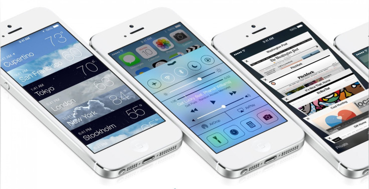
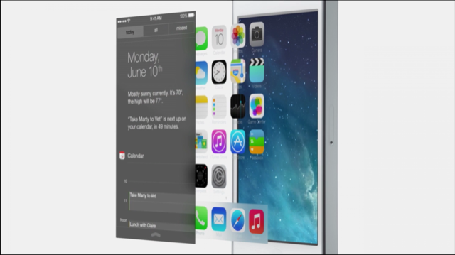
"iOS 7 is a clear representation of these goals. It has a new structure that’s coherent and applied across the entire system. We’ve considered the tiniest details, like refining the typography, like much larger ones to redefining all new icons, and creating a grid system to create a much more harmonious relationship between individual apps. We’ve also included a whole new palette of colors. Distinct, functional layers help create hierarchy and order, and the user of translucency gives you a sense of your context. These planes combined with new approaches to animation and motion, create a sense of depth and vitality.
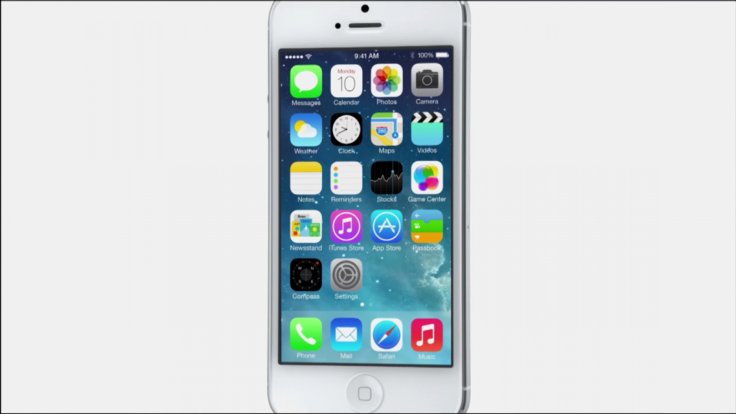
"The iPhone responding to your movements gives you an opportunity to create a whole new experience of depth. In many ways, we tried to create an interface that’s unintrusive and deferential. One where the design recedes and in doing so actually elevates your content. Even the simple act of chancing your wallpaper has a noticeable effect on how your iPhone looks and feels across the entire system. While iOS 7 is completely new, it was important to us to make it instantly familiar. We wanted to take an experience people know very well and actually add to it to make it useful, to make enjoyable. To create it, we brought together a broad range of expertise from design to engineering. From what we’ve been able to achieve together, we see iOS 7 as a defining new direction, and in many ways, a new beginning.”
“This major effort is only possible because of the incredible collaboration between Jony and his amazing design team, and Craig and his incredible engineering team,” Cook said.
Apple's SVP of Mac engineering took the stage to explain many of the new features in iOS 7.
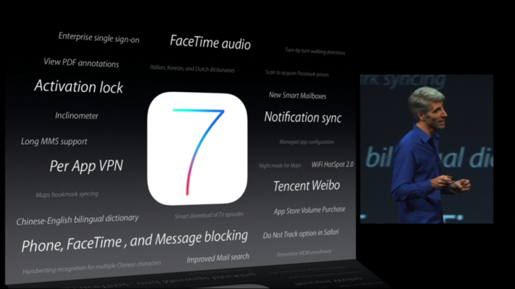
“A lot of us have our own wallpaper, and now, that liveliness actually carries through to the home screen," Federighi said. "Because as you move the device in your hand, it actually senses your motion and the parallax. The motion conveys this information and the edge-to-edge design takes advantage of every pixel on the Retina Display. It’s great for apps you use every day like Messages, Calendar, your Email is gorgeous, your friends never looked better. In Game Center, we ran out of green felt. And wood. We’re saving the environment.”
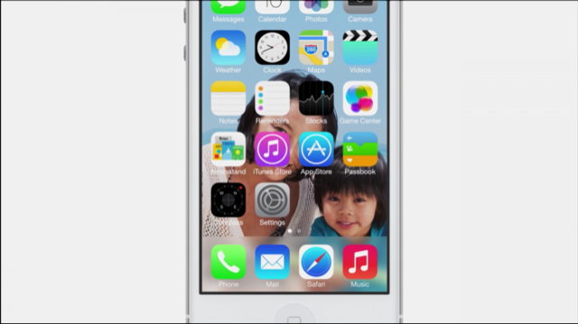
In our first live look at iOS 7, the iPhone running iOS 7 responds to the motion in one’s hand. By sliding the translucent lock screen up from the bottom, you get to all your apps quickly and easily. Within the Weather app, when you swipe across the different locations, the background changes dynamically based on day and night, and it’s easy to view all locations at once with all of the dynamic backgrounds moving behind all the information.
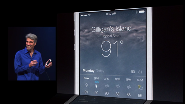
In Calendar and Messages in iOS 7, everything is white and all layers are slightly transparent to provide a sense of context. In-app browsing is easy with just a swipe from the side of the screen, and browsing folders is incredibly easy, and you can fill your folders with as many apps as you want. The Notification Center is given a new transparent look, and you can see all of your events today and tomorrow, but it can also be opened from the Lock Screen for the first time in iOS 7.
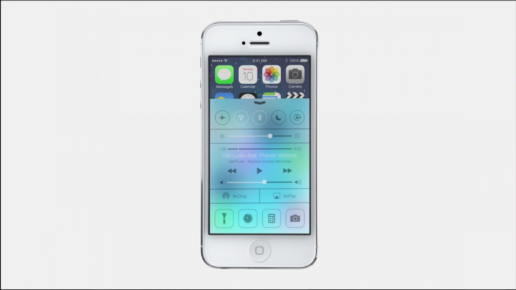
“It’s a comprehensive, end-to-end redesign of the iOS experience,” Federighi said.
Federighi described several “major features” in iOS 7. Control Center lets users swipe up from the bottom of the device to easily toggle settings, like AirPlay mode, brightness, and music -- just like the Auxo jailbreaking app -- in any application, making it extremely easy to change settings on the fly. Multitasking is a big feature in iOS, and in iOS 7, users can multitask all apps. In Safari for iOS 7, the full-screen look allows users to focus on their content, and the smart search field has unified search and Web addresses, as well as easy access to favorites. Tabs have a new interface that looks like the bird’s eye view of a folder, and tabs are now unlimited in iOS 7, whereas before, users could only have eight tabs at a time. Browsing through one’s history is also as easy as swiping from the edges of the screen, and bookmarks can be triggered with a swipe from the bottom, which also includes the reading list that’s synched across a user’s various Mac and iDevices.

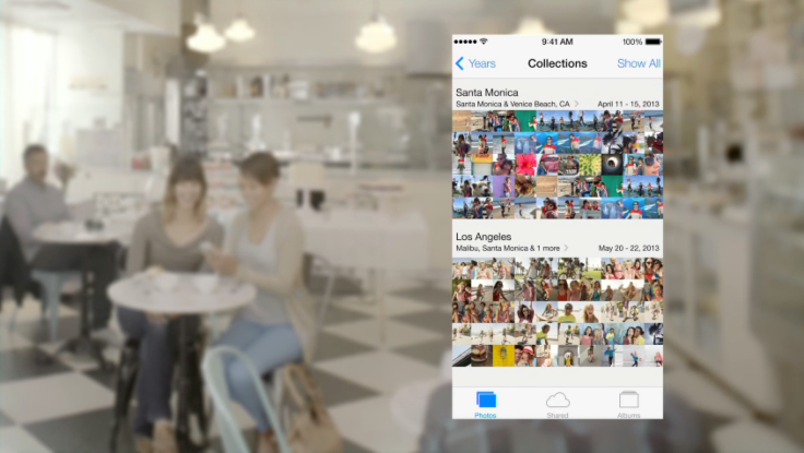
Federighi also introduced AirDrop for iOS 7, so now, any time you want to share photos, webpages or anything at all, you can easily share documents with all of your friends using peer-to-peer encrypted WiFi. The camera app has also been updated to take photos, video, panoramas, and now even a square-cropped camera. Apple has even given users photo filters directly inside the app. The Photos app has also been redesigned for iOS 7, so your library of photo is now categorized by “moments” – photos are organized based on where the photos are taken and when. Users can even see their photo collection from afar, by months or years, and categorizing that way pulls out all your various vacations based on location information. To find the photo you’re looking for from that bird’s eye view, users can simply tap and hold their finger on any photo to see an easy preview. It’s also easy to add effects to photos, and sharing them is also accessible via AirDrop, Twitter, Facebook, and now iCloud, where other people can share into your Photo Stream and create a group photo album. The Shared tab at the bottom of the new iPhoto in iOS 7 also shows what has been previously shared among friends and family, and for the first time, users can now share videos with one another in iOS 7.
Siri in iOS 7 has been given a new interface, which shows a sound wave across the bottom to let you know you’re speaking. Apple has added higher quality male and female voices for Siri, which are now customizable for users, but it now knows how to control more of your device, so it can play your last voicemail or increase your phone’s brightness settings. It can answer many more questions too, thanks to integration with Twitter and Wikipedia, and even Web search results from Bing. After Siri, Apple software SVP Eddy Cue introduced iOS in the Car, which allows one to manage their phone calls, Maps, and iMessages, all eyes-free and direct from the car’s screen. Apple is working with 12 different car manufacturers to introduce iOS in the Car for 2014.
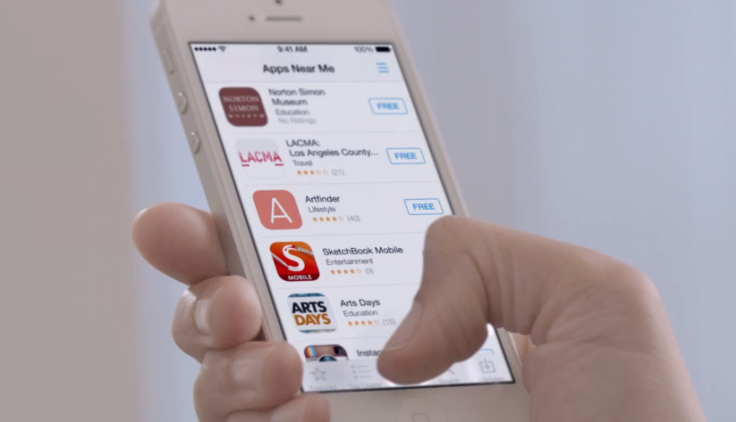
The App Store has been redesigned to show users more apps that apply to them, based on their age or what’s around them, so if they’re in a mall, they can download apps for Macy’s or other stores nearby. The App Store will now update automatically.
In the new iTunes for iOS 7, the app shows all your purchased music from iCloud directly in your library, as well as your movies and TV shows. By turning the device sideways, iTunes in iOS 7 shows album artwork in a grid format. But most importantly, iTunes introduces the long-awaited Radio platform – called “iTunes Radio,” not “iRadio” – to let users create their own stations and customize them on the fly. Users can modify the station to play more songs like the one you’re listening to, or never hear the same song again, or add a song to one’s “wish list,” which makes it exceedingly easy to preview songs in the iTunes Store and buy them right from there. iTunes Radio is free with ads, and iTunes Match subscribers see a completely ad-free version of the service.

Finally, iOS 7 includes a new feature called Activation Lock, wherein if a thief tries to use Find My iPhone or they even try to activate it, everything will be erased automatically. The new feature will help against device theft, Apple’s Craig Federighi hopes.
There’s much more to see and do in iOS 7, and we recommend you checking out Apple’s website to watch the video and learn all about the new features. What do you think of Jony Ive’s redesign of iOS 7? Do you like the changes, or do you wish more was done? Will you miss the old iOS design? Let us know in the comments section below.
© Copyright IBTimes 2024. All rights reserved.


