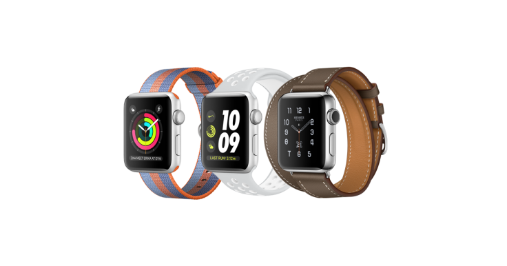
Apple Watch Series 3: Features That Make It Stand Out

Apple released their Watch Series 3 on Wednesday, and even if you have a passing interest in gadgets, this is interesting given that it’s the newest smartwatch from Apple.
Here are some of the features of the Series 3 to see if Apple has taken the Watch significantly ahead or not.
Design
The Apple Watch’s design is rather iconic. And the same design aesthetic that you are familiar with by sight if not experience is carried over to the Series 3.
Since Apple watches are now owned by millions of Americans, this means that you would have a hard time projecting a unique personality by virtue of the watch’s design. However, it must also be said that the square design with its colorful display is extremely functional. It’s easy to read text on the screen whether you are indoors or outside.
Also, the two buttons and a touchscreen combination lends to easy navigation on the interface.
The spinning crown on the device is not just cool-looking. It makes scrolling through lists a breeze. Also, you can zoom in on images and maps using the crown and even make volume adjustments while listening to music.
Speed
While the design remains the same as the previous Apple watches, the responsiveness improves significantly with the Series 3. This is largely because of the new S3 processor. Also upgrades have been made on the watchOS. So, just about every process should take place faster on the S3.
This would not only make the interface more responsive, third-party apps would also open much faster. Siri should also work faster with the S3.
Due to the better responsiveness, you could now do on your watch things that you so far did on your phone like checking the weather and setting the timer.
Battery
Compared to the previous Watch versions, the battery life is significantly improved in the Series 3. Apple says that the S3 comes with a battery life of "up to 18 hours." But with the more efficient processor and a bigger battery cell within the Watch, the battery life could be even more in reality, depending on your use.
Touch and slide functions
One function that’s missing in the newest Watch, compared to the last version, is the bringing up of a list of favorite contacts by tapping the side button.
In S3, by pressing the side button, you can pull up a vertical carousel that shows the apps you recently accessed.
By swiping up from the watch face, you could open the toggles for functions including sound and connectivity. To see all your notifications, you could swipe down from the top, and if you want to change watch faces, swipe left or right across the screen.
While the above mentioned are new functions with the S3, one thing it carried over from the previous model is the function by which you could bring up the app icons by pressing the crown’s button.
Now, about a function that's missing from the S3
Along with the features that are present, it also merits mentioning one feature that's not present in the S3.
Like with the earlier Watches, the always-on display function is missing in the Series 3 as well.
This means that the screen will remain off unless you lift your wrist or in the event of a notification, or if you tap on it. So, to check the time, you couldn’t just quickly glance at the watch but would need to raise your arm to interact with the device in one form or another.
The lack of the always-on display function contributes to the longer battery life though.
To conclude, you could say that Apple has given us a faster watch but one which retains the design and functions — to a good extent — of the last Watch in the series. It’s hard to imagine someone who has never seriously thought of owning a smart watch making the transition, going by the features for the Series 3.
But with these features, there is hardly any doubt that Apple has just delivered arguably the best smartwatch till date.
© Copyright IBTimes 2024. All rights reserved.


