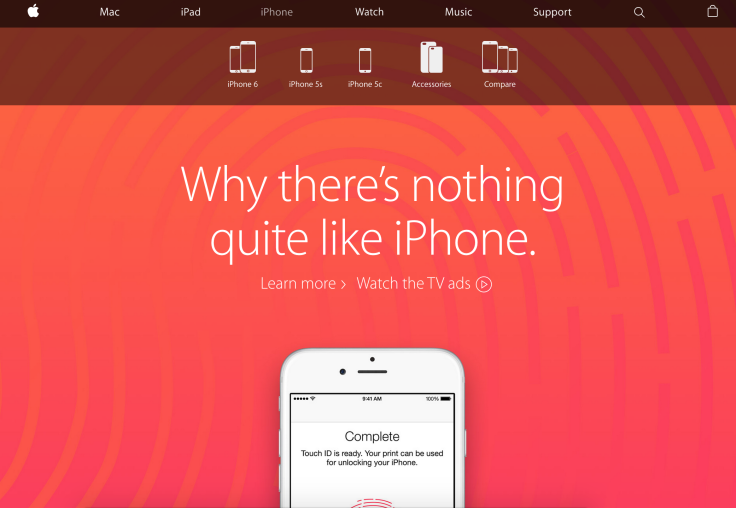
Apple.com Undergoes Major Redesign, Adds 'Buy' Button To Every Page To Spur Online Sales

Apple has rolled out a major redesign for Apple.com, one of the top 50 websites on the Internet, that's intended to make shopping for the tech giant's products faster and easier. The new look, which is the first major update to the site in some time, went live Thursday afternoon.
With the redesign, Apple has gotten rid of its seperate store, the Apple.com website. In its place, the company has integrated the shopping experience into Apple.com by adding 'buy' buttons throughout the majority of the website and purchase pages as well, making it easier for users to browse products and then purchase. For example, users who check out the iPhone portion of Apple.com can press "buy" to head over to the smartphones purchase page, while users browsing for Apple Music information can click on "try" and instantly launch iTunes on their computers.
“We redesigned Apple.com knowing that our customers want to explore, research and shop in one place,” Apple said in a statement, according to TechCrunch. “The new Apple.com takes the very best of our existing site and our online store to give customers one simple destination to learn and buy without navigating between two different sites. We’ve also improved several of the site’s features to make shopping easier than ever for our customers.”
Apple changes the images and information on Apple.com every time a new product is announced, but rarely does the Cupertino, California, company pull off overhauls like Thursday's. The revamped Apple.com, which receives more than 1 billion customers every year, is now live and available for shopping in 40 countries.
© Copyright IBTimes 2024. All rights reserved.


