

Burger King’s Rebranding Has Twitter Calling Foul: It’s The ‘Old Logo’
Burger King has revamped its logo, the first overhaul in over 20 years, but fans of the burger chain are not so sure of the company’s bold move.
Burger King announced the logo change on Thursday, saying it was “inspired by real and delicious food” with a more modern take that will “more authentically represent Burger King values” going forward.
The logo, they said, better reflects Burger King's “food journey” by capturing what the company called its “mouthwatering, big and bold, playfully irreverent, and proudly true” brand characteristics.
“Design is one of the most essential tools we have for communicating who we are and what we value, and it plays a vital role in creating desire for our food and maximizing guests’ experience,” Raphael Abreu, Restaurant Brands International head of Design, said in a statement. “We wanted to use design to get people to crave our food; its flame-grilling perfection and above all, its taste.”
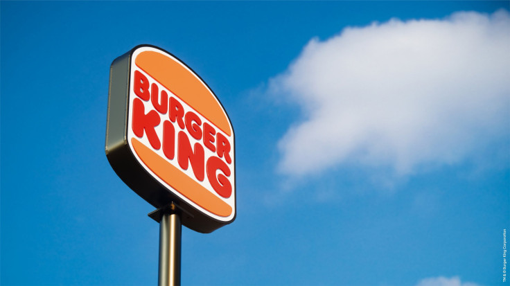
The transition from the current logo, which was introduced in 1999, to the new minimalistic logo pays homage to Burger King’s heritage while building on a design that the company said is “confident, simple, and fun.”
The colors of the logo were selected to be rich and bold, inspired by Burger King’s flame grilling process and ingredients, while the font was chosen because it was called “Flame” and was “rounded, bold, and yummy” like the company’s personality, it said.
But Twitter had some other ideas about the new logo from Burger King, which it claims mimics its logo from previous years.
I See Burger King Old School Logo Is Coming Back
— Tankbro6 (@tankbro6) January 7, 2021
Sanity prevails and Burger King gets its old logo back.https://t.co/GnMvvs2kpD
— Stephen Waller (@bruised_blood) January 7, 2021
Burger King's new logo is actually Burger King's old (pre-1999) logo. There is no discernible difference.
— Kerry Lee (@VladTubaka) January 7, 2021
I ... approve. _
Others on Twitter have even suggested that Burger King’s logo looks oddly similar to some other well-known logos.
Hmmmmmm Burger King vs. Kingdom Burger? #EverydayEthiopia pic.twitter.com/h8Lpd9FKzF
— Samuel Getachew (@GetachewSS) January 5, 2021
It looks a lot more like the hungry jacks logo, which is also owned my burger king (hungry jacks is basically Australian Burger King since burger king couldn’t get the trademark in Australia) pic.twitter.com/rKOV0rI4TJ
— oub / commissions open _ (@oublou) January 6, 2021
Why does it feel like the cookie jar logo is the son of the burger king logo? pic.twitter.com/xqCtSevG1w
— Red Sprite Art Person (@RedMegamanGuy) January 2, 2021
Some on social media used the new logo opportunity as a chance to roast Burger King.
"Burger King has redesigned its brand including its logo, food packaging and restaurants"
— Huh? (@Huh65445889) January 7, 2021
But not to worry, patrons will still get the same diarrhea, clogged arteries, and diabetes that they're used to.
New Burger King logo has too much bun.
— Gary Gastelu (@garygastelu) January 7, 2021
Where's the beef?! pic.twitter.com/AFFY3FcPE6
But others approved of the new branding, saying they liked it.
Glad Burger King changed their logo. Much cleaner.
— SCARAMUCCI MANE __ (@admiralsid) January 7, 2021
The rebranding comes as Burger King made the decision in October to remove all colors, flavors, and preservatives from artificial sources from its menu items as it looks to be more environmentally sustainable.
At the time, the chain put the recipe for its Whopper on the wrapper to show its transparency in producing the burger with all-natural ingredients.
Burger King will include the new logo on all packaging, merchandise, menus, crew uniforms, signage, restaurant décor, social media, and digital and marketing assets. The restaurant said the logo will roll out starting in early 2021.
© Copyright IBTimes 2024. All rights reserved.
- MOST POPULAR IN Business


