Donald Trump’s ‘Misleading’ 2016 Electoral Map Explained; What POTUS Missed To Consider?

KEY POINTS
- Donald Trump's 2016 electoral map was misleading
- Trump's 2016 electoral map called “fake news” by a Twitter user
- POTUS wrongfully blames Barack Obama's administration for the coronavirus testing problems
Donald Trump’s 2016 electoral map was misleading because he forgot to consider a crucial detail when he shared it.
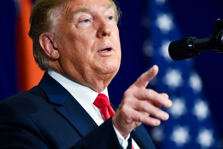
Last year, Trump shared the electoral map that was filled with red color. On Tuesday, the president used the same map when when he spoke with the National Association of Counties.
“Oh I love those beautiful red areas that middle of the map,” the POTUS told the audience. “A little blue here, a little blue there, and everything else ... everything else is bright red.”
Chris Cillizza, CNN editor-at-large, explained that the map Trump used was misleading. While it’s true that the majority of the map was colored in red and was evidence of the fact that he won 2,626 counties to Hillary Clinton’s 487 counties, there was something he failed to consider.
“What this map doesn't prove is what Trump thinks it proves and why he loves it so much: That America is overwhelmingly pro-Trump or pro-Republican,” Cillizza wrote. “Why not? Because Trump's favorite map doesn't take into account one very critical piece of the electoral equation: Population.”
Haya El Nasser wrote on the U.S. Census website in 2017 that over half of all residents live in 143 big counties. The analysis of U.S. Census Bureau county also revealed that less than half of the population is spread out across the remaining 2,999 small counties.
The county-by-county map showed that Republicans are totally dominant if land voted. However, it doesn’t dismiss the fact about the 2016 election that Clinton received 65.8 million votes compared to Trump’s 62.9 million.
"That Trump's favorite visual from the 2016 election is one that deeply misleads about not only that election but also about the partisan splits in the country is not terribly surprising. Trump has shown a tendency throughout his life -- in and out of politics -- to bend and break facts to fit his preferred narrative. Trump's loving embrace of the county-by-county map is just more of the same here.Which doesn't, of course, make the map say what Trump says it does. Because, well, it doesn’t,” Cillizza concluded.
One online user called Trump’s post in 2019 “fake news.” According to the netizen, it was a “cute little meme map.” She also stressed that “land area does not equal population,” pointing out that some areas colored in red had zero voters.
#StableGenius,
— Trinity 🇺🇦 (@TrinityResists) October 1, 2019
You have a lot of red sharpie going on in your cute little meme map. It’s the same incorrect one your daughter in law tweeted.
I’m sure you don’t want to mislead the country with #FakeNews so here’s the correct map of the 2016 election by county.
You’re welcome. pic.twitter.com/Nm4V7vCroF
In related news, Trump wrongfully blamed Barack Obama’s administration for the coronavirus testing problems. The POTUS said the former president regulated lab testing, making the process difficult at present. However, it turned out that while there was a proposal to give the FDA more oversight over diagnostic testing, it wasn’t approved, so it was never pushed through.
© Copyright IBTimes 2024. All rights reserved.


