Google Maps The History Of Song With 'Music Timeline’ Visualization

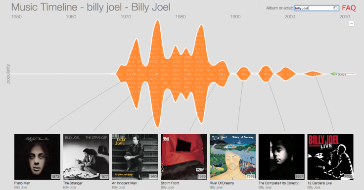
Google (NASDAQ:GOOG) quietly announced a new feature on its Research blog last week that visualizes trends in popular music. The Music Timeline, as it's called, is an interactive graph that showcases music over the course of recent history.
The Timeline uses data the search giant collected from Google Play Music, and allows users to chart the rise and fall of artists, albums and genres since 1950. Google says it excludes earlier time periods since data collected before that era was “too sparse to visualize.”

Google says it also normalizes the Music Timeline because information before the digital age is tougher to acquire. The team says it scaled the visualization based on the number of albums released in a calendar year. Click here to explore Google's Music Timeline.
Google also opted out of classical music with the visualization, because, it says, placing it on the timeline is too hard to define. For instance, the question of whether to date a concerto when it was written by Mozart in 1791 or recorded by the Boston Pops in 2009 could be a difficult one to address.
Google’s Music Timeline is an offshoot of the company’s Big Picture project, which it says explores “how information visualization can make complex data accessible, useful and even fun.” Other projects include a Digital Attack Map that visualizes data on denial-of-service or DDOS, attacks from around the globe, and a YouTube Trends Map that updates daily with what videos are going viral, and where.
Google Play Music offers a premium subscription service called All Access that competes with Spotify, Pandora and Apple's iTunes Radio. The Music Timeline, Google says, was produced by a collaboration of Google’s Big Picture project and Music Recommendations and Discovery team.
Follow Thomas Halleck on Twitter @tommylikey
© Copyright IBTimes 2024. All rights reserved.


