Google Play Store Is Getting An Update With New Design, User Interface Improvements Soon

Google is always experimenting with new features and improving the user interface of all of its apps and services. Now, it’s been discovered that UI changes to the Google Play Store have been popping up for some users.
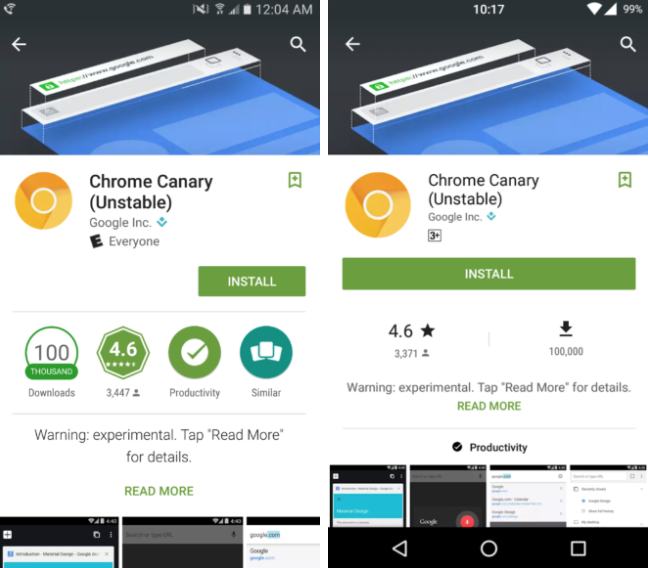
Some users have begun reporting that they’ve been seeing some dramatic changes to the Google Play Store. Particularly, the store’s color scheme and overall layout. The first screenshots of the upcoming new version of the Play Store was taken from readers of Android Police.

The “Install” button is now bigger than before, while the number of downloads, as well as the app ratings are a lot more distinguishable. The category to which an app belongs to is now located beneath the app’s description and is centered. As for the overall look of the Google Play Store, the user interface now comes in a darker shade of green.

Another set of screenshots shows that the app carousel on the main Play Store page is a bit smaller. The second set of screenshots teases that the “More Information” page has been relocated above the developer’s information. It was previously located under the app description.
The new UI has appeared on a Nexus 6P running Android 7.1.1, according to a separate report from Phone Arena. As of now, it looks like Google is still testing out the new user interface for a small number of users as well as for some apps on the Play Store. With some users already seeing the updated look, it’s possible that these changes will be rolled out widely very soon.
Google first teased the new look of the Play Store when it published a video on YouTube on how to get started on using its new Pixel smartphones. The recently published screenshots exactly match what the Play Store looked like on Google’s video.
© Copyright IBTimes 2024. All rights reserved.


