HTC One M9 Review: A Good Phone, But It Doesn't Push The Envelope [VIDEO]
When HTC released the One M8 in 2014, I was enamored -- it was a jack of all trades with a cool metal motif and build quality that helped force Samsung to rethink the Galaxy line. It was different, well-balanced and quick with an easily customizable interface. But the smartphone market changes so rapidly that what’s in vogue last year will be outmoded before its first birthday. Design has to stay fresh to have a shot at the top. HTC hasn’t done this.
Instead, the HTC One M9 relies on the success of its two previous generations, sticking to the same tricks. This doesn’t mean that it’s a bad device by any means -- actually, if you liked the M8 when it came out but were unable to grab one at the time, this will be a great fit -- but with the recent advancements of other Android manufacturers, HTC’s new flagship is getting a bit lost in the shuffle. Even millions spent hiring Robert Downey Jr. as brand ambassador have done little to sway public opinion.
Model: HTC One “M9”
Size and Weight: 5.69 x 2.74 x .38 inches, 5.54 oz
Display: 5”, 1920x1080 LCD, 441ppi
Camera: 20 MP rear camera with dual-LED flash (shoots 2160p@30fps, 1080p@60fps, 720p@120fps, 4MP front (shoots 1080p @30fps)
Platform: Android 5.0 “Lollipop”
Performance: Quad-core 1.5 GHz Cortex-A53 & Quad-core 2 GHz Cortex-A57 with Snapdragon 810 chip. 3GB RAM, 2830 mAh battery
Memory: 32GB internal storage, expandable via microSD card to another 128GB
Connectivity: Wi-Fi, Bluetooth® 4.1, aGPS, NFC
Price: ~$649 unlocked, $199 with 2 year Verizon contract (tested)

The Good
Much like its well-loved predecessor, the M9 is a solid phone crafted from two big pieces of brushed aluminum. That makes it not just one of the best-looking phones on the market, but one of the toughest too, as I found out with an impromptu drop test from a table onto a tile floor. Multiple drops (from roughly 3-5 feet up) onto hardwood floors, tarmac, concrete and airport floors left no marks either -- it’s safe to use the M9 without a protective case.
Despite the strength, the One M9 doesn’t feel particularly heavy. It’s not a featherweight, of course, and it’s on the large side of the 5 inch phone bracket, but its curved back makes for easy and confident handling as long as you’ve got larger hands.
In case you do break it, HTC will give you a new one, no questions asked for the first year you have the phone -- that’s the “Uh Oh Protection” that comes with the M9, which HTC hopes will sway some buyers. It’s a nice feature even if you don’t use it; HTC will give you $100 towards your next HTC phone if you don’t break your M9.

Assuming you don’t break it, you’ll be looking at a 5 inch, 1080p LCD screen. It’s mostly the same as last year’s offering, with some reworked colors. It’s soft and lacks contrast next to the Galaxy S5 and S6 AMOLED screens, but it’s plenty bright. It’ll get the job done, and it’s a bit easier on the eye if you don’t love super punchy colors.
Also carried over is the dual Dolby speakers on the front face. They’re probably still the best sound output you’re going to get from a phone.
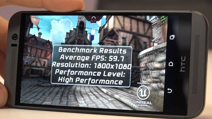
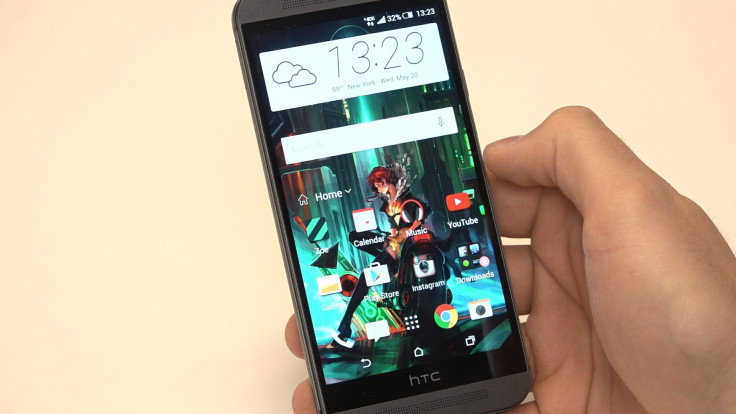
The M9 rivals the giants in power, as well. It’s using a Snapdragon 810 chip and has 3 gigs of RAM, so there’s plenty of muscle for heavy lifting. HTC’s “Sense” UI runs beautifully smooth with that much power, and the Blinkfeed curation service is as helpful as ever. It’s all backed up by a large library of customizable themes within the HTC ecosystem. It’s a nice option for those who like switching things up often, but don’t want to swap launchers or root their phone.

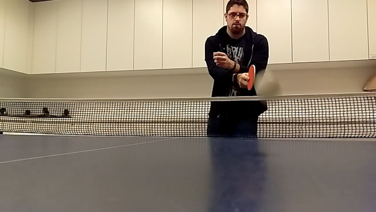
Both camera setups on the M9 are improved, up to a 20.7 megapixel rear lens and 4 megapixel front lens. Photos are, for the most part, good quality, though full-auto shots tend to be underexposed. The rear camera can also shoot 120fps at 720p.
But all of these are the same things that were said about the last HTC One.

The Bad
HTC’s caught a lot of heat for the M9, and it’s easy to understand why. Aside from a few incremental bumps and the rear lens, the M9 isn’t different from the M8. There’s still a lot of good features, but there’s nothing different or groundbreaking -- in a year with radical redesigns like the Samsung Galaxy S6 and iPhone 6, the HTC One M9 is a very tame update. They haven’t even added wireless charging.
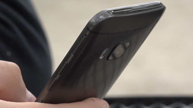
One thing HTC did change is the power button. Last year’s model had it on the top of the body, like an older iPhone, which wasn’t a great location. Now it’s on the center of the right edge, next to the individual volume buttons ... which feel the same as the power button. At least you couldn’t hit the power button while searching for the volume toggle last year. Changed, but not improved.
Conclusion

There’s nothing really new or exciting for the M9 to bank on, aside from HTC’s “Uh-Oh Protection.” Anything it can do, the other big players match or beat it. By no means is the M9 a bad phone -- there’s no “Here’s Why You Shouldn’t Buy An HTC One M9” article to see here. It’s a good phone. But while other phone lines are trying new things, the One is business as usual. Other brands can get away with an incremental upgrade if they can convince buyers that each yearly upgrade is necessary (just look at Apple's current "Phone/PhoneS" pattern), but HTC doesn't have the clout to pull this off. Perhaps new HTC CEO Cher Wang will see to it that the next HTC One creates a big splash.
© Copyright IBTimes 2024. All rights reserved.


