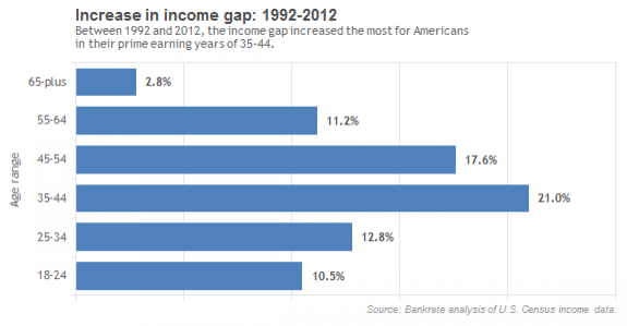
INFOGRAPHIC: The Data On Income Inequality In The US Do Not Paint A Pretty Picture

The U.S. has long been viewed as the “land of opportunity,” where those who work hard get ahead. But the ever-widening wealth gap is putting the American dream out of reach for many. The gulf between the top 1 percent earners and the rest of the country grew to its widest level in history last year.
Thanks to VisualizingEconomic.com, here are four charts from Catherine Mulbrandon's book "An Illustrated Guide To Income In The United States" that lets you see the extreme income inequality in the U.S. using several different graphic approaches.
© Copyright IBTimes 2024. All rights reserved.
Join the Discussion


