Microsoft Social Network So.cl Launches, ?Doesn?t Seem To Be Built For Mass Appeal,' Critics Say

In the era of emerging social media platforms, it may seem as if all forms of virtual communication have been covered. With Facebook and Twitter spearheading the social media scene, cyber networking offshoots have formed to cater to specific needs such as Pinterest and LinkedIn. Now it seems that Microsoft is looking to develop the social media landscape even further with its latest creation called So.cl.
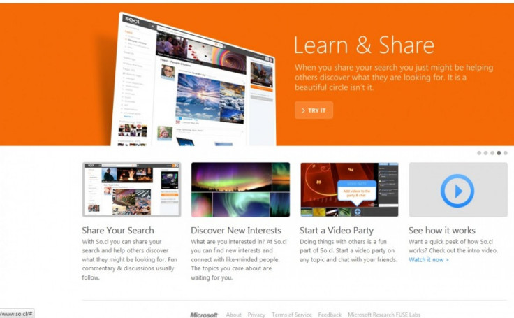
The new website takes successful elements of various social sites and combines them under one domain. So.cl is geared toward the student community, just like Facebook was when it initially launched. However, the emphasis seems to be on social research rather than social interaction. One of the features highlighted in So.cl's preview video was the search engine. Users can type what they're looking for in the search field and then they have the option to share their results with friends and followers. A communal feed shows what users share, with the intention of facilitating research among peers.
Microsoft described the new tool as A new research experience for students, and users have the option of interacting via video as well.
Doing things with others is a fun part of So.cl, the description reads. Start a video party on any topic and chat with your friends.
The So.cl website certainly does have an educational overtone to it, with a focus on sharing searches and discovering new interests. But not in an overtly obvious way; before taking a close look it's easy to mistake Microsoft's new venture as a typical social networking site. But So.cl takes characteristics from Facebook, Pinterest, and Stumble Upon among others to create a new way of sharing information to enrich the learning process, or so it seems.
Similar to Pinterest, users must wait for an invite before they can begin exploring the free online service through Facebook. Those who sign in with a Windows Live ID can gain immediate access. When signing in, a pop-up window appears suggesting general interest categories and people to follow, as PC World notes in their guide. Then users are taken to the Explore page, which displays general interest categories users can follow. This is done in the traditional Windows format seen in the Metro-style mobile interface. The left side of the screen is a navigation column filled with links such as Feed, Post, Profile, Video Parties and Interests.
However, since the site is still under the Microsoft Research banner, there are still bugs and kinks that need to be smoothed over. There may be times when links don't work and functions will be limited, such as content not populating your feed properly. Exploring the site may also not be a user-friendly experience, according to Buzzfeed.
Navigating the site is pretty far from intuitive, writes Summer Anne Burton of Buzzfeed. For example, when trying to find interesting people I could follow (since no one I actually know is there yet), it automatically suggests ten popular people with no option to either see more, or check out their profiles without following them.
Burton also added that there is no way to import a photo for a profile picture. Users must either use their Windows Live picture or give it an existing URL.
One of the major takeaways from what can be said about So.cl so far is that it isn't for everyone, and it's still in its developmental stages.
So.cl doesn't appear to be built for mass appeal, writes Ian Paul of PC World. I'd say if your life is already filled with tweets, Facebook likes, and LinkedIn status updates, you can safely skip So.cl without missing much.
© Copyright IBTimes 2024. All rights reserved.


