Misfit Shine Review: Still The Sleekest Fitness Tracker, But Lagging The Competition

When the Misfit Shine came on the scene in 2013, the sub-$100 wearable was the most elegant fitness tracker on the market. The tradeoff for the clean, minimalist look was relatively limited features, and a device that was very reliant on its companion smartphone apps. This fall, Misfit introduced a second, cheaper version of the Shine, the sub-$50 Flash.
A year is an eternity in the tech world so we decided to see if the venerable Shine has what it takes to stand up to newer competition from the likes of Fitbit Flex, Jawbone Up and Withings Pulse. From an aesthetic perspective the sleek Shine wins hands-down. Unfortunately, there’s not much to it beyond that. I didn’t expect much from the Misfit Shine. And yet I still came away disappointed.
Design
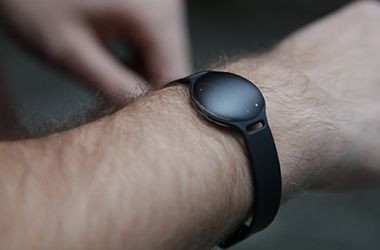
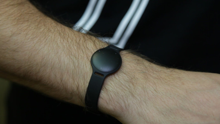
CNET praised the Misfit Shine upon initial release, calling it “stylish and futuristic.” Aesthetics are subjective of course, but the Shine feels like a black Mentos tablet. At best, it could pass as a toy watch you’d buy at the grocery store just to stop your child’s hissy fit.

It’s difficult to imagine where your $99 (Misfit’s MSRP) is being spent.
But, to Misfit’s credit, you can put the Shine in a few different holsters to change the look. None is particularly more attractive than the others, however. The Shine...well, it doesn’t shine. If anything, the most kind adjective is minimalist, a trait that kind of contradicts the whole “Misfit” name.
There’s no real interface on the Shine itself -- you tap the face to get a vague daily progress indication, followed by the time. Everything’s represented by LEDs, which is an interesting idea, but it’s not totally accurate or intuitive. The clock is represented in an analog format, which is beautiful on traditional watches (and a preference of mine), but it leaves a gigantic white (black, in this case) space in the center of the shine. It seems like the obvious place to put more LEDs for a digital clock.

The Shine doesn’t have a USB port for charging -- that’s because it’s power by a disc battery -- which necessitates the Shine’s shape. The good news is that the battery should last a few months, and everything’s sealed, so the Shine is waterproof (submersible up to 5atm, which is useful for swimmers).
App
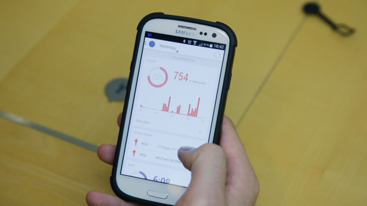
But any real points the Shine might have won with battery longevity and waterproofing went straight down the drain when opened the app. There’s not a whole lot going on in the Android version of the Misfit app. Just a sparsely populated home screen and a few sad submenus without much information to track.
Everything works on a points scale, for some reason. You get points for automatically tracked activities, but it’s never made clear how much more high-intensity exercises are worth -- a .75 mile run was worth 709 points, yet a 15 minute hike only granted 100. None of the metrics were ever explained.

To be fair, the iOS version is reportedly much better, but if Misfit wasn’t ready with an equally robust Android experience, they shouldn’t have released it.
Value
The Shine is $100. If you’re an Android user, skip this altogether -- the app is just not ready for primetime, and even if it was, there are higher quality devices in the price range.
Conclusion
Maybe Misfit’s next wearable will be more worthwhile. But as it stands, Unless you’ve got an iPhone, you should pass on this.
© Copyright IBTimes 2024. All rights reserved.


