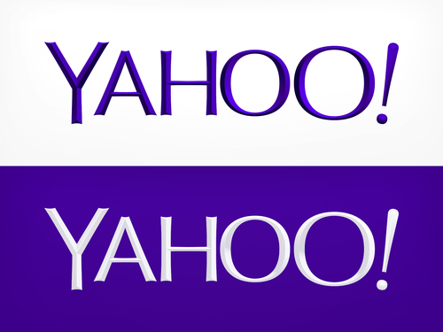
The New Yahoo (YHOO) Logo Is Ugly, Say Design Experts, But It Doesn't Matter Anyway

After a month of drumming up interest with purple smoke and mirrors, releasing new design ideas by the day, Yahoo Inc. (NASDAQ:YHOO) has a new logo.
The resounding opinion among design experts? It’s disappointing and, frankly, bland.
“I do not like it,” Anna Milivojevich, creative director of Brooklyn-based bluemarlin New York, told International Business Times. “I’ve been reading and following this 30-day campaign and I read a lot about ‘whimsical and sophisticated.’ I’m not seeing whimsical enough. Sophisticated? That isn’t for a brand like Yahoo. Even the sound of the word is not sophisticated.”
The Sunnyvale, Calif., company unveiled its new symbol after 30 days of testing different designs. Claiming she knows “enough to be dangerous” on Adobe Illustrator, CEO Marissa Mayer said on her Tumblr that she had a big role in the redesign: “One weekend this summer, I rolled up my sleeves and dove into the trenches with our logo design team.”
Preserving the purple and white coloring, the new logo sports a sans serif font with three-dimensional lettering, forgoing the jagged, cartoonish serif of the last look.
“All these old Internet logos had a similar look to them – wacky isn’t the right word – but bouncing around and quirky,” David Ceradini, whose firm Ceradini Brand Design in Williamsburg, Brooklyn, has worked with Heineken USA, Unilever and Procter & Gamble, told IBTimes. “Maybe what they were trying to do is say, ‘Let’s not be so comic booky and quirky. We’re a big company and adults and let’s start acting like it.’”
“But, to me, it’s lost a lot of personality,” he added.
“What is gained here? To me, it looks slightly less distinctive,” Sagi Haviv, a partner at the Manhattan-based design firm Chermayeff & Geismar & Haviv, told IBTimes. “I’m not extremely excited about this from a design standpoint.”
But he said the actual logo matters very little to the brand.
While Tumblr, which Yahoo acquired for $1.1 billion in June, appears to some to have a youthful front and logo, Haviv said the lettering is actually reminiscent of stodgy educational institutions.
“If it’s done well, we as consumers will transfer our feelings and associations about the product or the company onto that logo; it’s just a vessel that holds all the associations that we have about the company,” he said.
So Yahoo’s new logo is more or less as good as its new products.
“In general, it doesn’t really matter,” Haviv said. “But if you get into the details of it, the previous logo is more distinctive and fulfills the role of the logo a little bit better.”
But for Zach Cole, a freelance designer in San Francisco and a marketer at the ride-sharing startup Lyft, the 30-day logo trial served well to drum up a lot of interest ahead of the unveiling.
“From a marketing perspective, it’s pretty brilliant was Marissa is doing,” he told IBTimes. “She knew people would talk about the logo whether they liked it or hated it. People are talking about it more than ever, which is a great end result for them.”
But what’d he make of it?
“Aesthetically,” he said, with a short laugh, “I don’t like the logo.”
© Copyright IBTimes 2024. All rights reserved.


