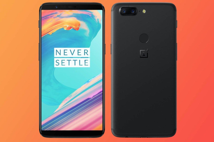
OnePlus 5T vs. OnePlus 5: Features That Make The New Flagship Better

Chinese smartphone company OnePlus has made a name for itself with its phones that sometimes sell for almost half the price than those offered by its more famous peers like Apple and Google, and still deliver comparable performances on many fronts.
With the entry of OnePlus 5T — their latest offering — the story of consistently upping their own game and undermining many of their stronger competitors seems to continue.
This is particularly true of the meaningful upgrades that the OnePlus 5T has over its predecessor, OnePlus 5, which hit the market about five months ago.
Take a gander at some of these changes that potentially make the OnePlus 5T one of the most exciting entries in the current smartphone landscape.
Thin bezel
Thin-bezel phones are going to rule the market in the future, and the OnePlus 5T goes a long way in taking the thin-bezel game to a whole new level. The edges of the phone flanking the screen have been minimized, and though the overall phone’s body isn’t much bigger than the 5.5-inch OnePlus 5, the 5T's screen size is bigger now.
The thin bezels add to slick design of the 5T, and it could still look good an year from now —and that’s not something that you could say about many phones in the market today.
Fingerprint sensor on the back
This is not the first time that the sensor has been incorporated in an OnePlus phone. However, what's different this time is that the sensor has been moved from the front — as was the case with the OnePlus 5 — to the back of the phone.
Covered with slick ceramic, you would find the sensor about a third of the length down on the back. Users of Google Pixel or LG V30 would find this familiar since that’s where the sensor is positioned on those phones. Having the sensor on the back is a good idea since this leaves you with a cleaner, clutter-free front.
Face Unlock feature
A new Face Unlock feature has been added in the 5T. While it's something that more and more users are looking for in new phones, the efficacy of the feature in the OnePlus 5T could only be judged once a sizeable number of users have it in their hands (or against their face, to be precise).
Camera protrusion
Curiously enough, the camera bump on the OnePlus 5T is thicker than that on OnePlus 5. The company has mentioned the screen taking up more space within the phone as the reason for this. In OnePlus 5, the camera module was within the space behind the bezel on the front.
But in the new phone, the camera system has been placed behind the screen. This means it would jut out a couple of millimetres more than in the previous model.
The bump could attract scratches as well, not something that would go down well with users.
Screen size
While the OnePlus5 had a display size of 5.5 inches, the newest iteration has a 6-inch display. However, the 5T's 6-inch screen has been curved at the edges to cram it into a 5.5 inch space. This means that the overall display size is not staggeringly different than before.
However, the 5T does score high on the display front since it uses Samsung OLED screens and not the ones from LG, which have been a bummer with both LG V30 and Google Pixel 2 XL.
Compared to the 16:9 aspect ratio of the OnePlus 5, the 5T’s screen parameter is 18:9. So, your binge-watching stands to get better with this one.
Tweaking of the Android buttons
With the 5T, you have the option to minimize the on-screen Android buttons.
This means that you could just hide them in the browser or other applications that you may be using until you wish to use them again. The hidden switches could be pulled back with just an upward swipe from the bottom.
This feature would let you enjoy the whole 6-inch screen to read emails, tweets and the like.
Sunlight Display mode
The Sunlight Display mode is another feature we are seeing for the first time with OnePlus 5T. The mode gets turned on when the phone detects that you are in bright sunlight. Parameters like contrast get automatically adjusted when you compose a video or photo, or begin a game or visit your gallery.
Reading mode
This feature remains the same from the OnePlus 5. However, it’s worth mentioning since it’s one of the coolest features on the phone.
Compared to most other phones, your eyes have it easy while reading on the 5, thanks to this mode. It’s safe to assume that the same would be true with the 5T as well. And yes, there’s the dark theme which flips the menus and app drawer into black. And that’s downright sexy!
With the addition of solid features and retaining the ones that make sense, and also with a starting price of $499, it looks like OnePlus may have another winner on its hand.
© Copyright IBTimes 2024. All rights reserved.


