Snapchat Update: Redesign Revealed, When It Will Be Available

Snap Inc. announced the specifics of the redesigned app on Wednesday, the changes came following disappointing third quarter earnings posted earlier this month. The earnings prompted Snap Inc. CEO and founder Evan Spiegel to announced that the app would be getting quite a facelift.
The goal was to make the app easier to use but Spiegel also noted that the redesign might have a disruptive impact on user engagement in the short term. Snap announced the specifics of the redesign on Wednesday. The changes are slowly rolling out to users over the next few weeks, starting first with a small group of users later this week, a Snap Inc. spokesperson told International Business Times.
The changes to the app were announced in a blog post on the Snap Inc. website and were accompanied by a video featuring Spiegel in which he explained how the redesigned app will separate the “social” and the “media.”
“With these changes we hope that Snapchat feels more familiar and inspires you to express yourself with your friends and explore more of the content that you love,” he says to a camera while standing in front of a Snapchat-yellow backdrop.
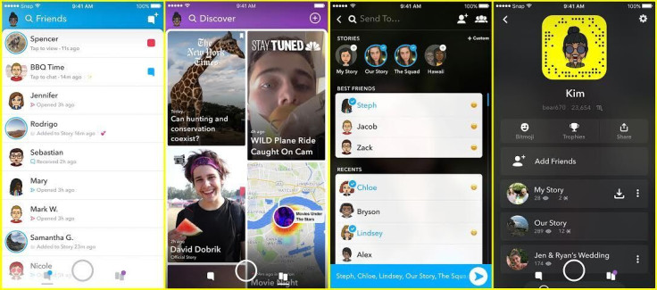
One thing that won’t change about the app is that upon opening it, users will first see the open camera screen. The most drastic change to the design of Snapchat is where users will find their friends and where they’ll find the media, or the “discover” content. Before the redesign, all of this appeared in a similar spot in the app, swiping left pulled up stories, swiping left again opened Discover. From the camera, swiping right would open chats and conversations with friends.
With the newly redesigned app user’s friends will be separate from the celebrities, news, and Discover content. “The new Snapchat separates the social from the media. This means that the Chats and Stories from your friends are on the left side of Snapchat, and the Stories from publishers, creators, and the community are on the right,” said the blog post from Snap. Opening up the list of friends will show then chat as well as any stories from friends. A story will be indicated with a blue circle around the friend’s name, and the words “Tap to view” will appear below their bubble.
In addition to shuffling content and friends within the app, Snap is updating the algorithm used for Chat. The hope is that this will already know who users want to talk to and will place those friends right at the top of Chat. Gone are the days of scrolling through a list of friends to find the right one to chat. While this will be introduced with the redesign, Snap warns that it might take a little while for it “to learn the best way to display your Friends.”
Discover will have a revamped algorithm as well. With the redesign swiping the camera to the left to access what is to the right of the screen will open Discover.
That’s where Stories from published, Snap creators and community stories will live with anything a user subscribes to at the top of the page, followed by other stories the algorithm thinks might be of interest to a user. Discover will also end up customized to the user after time.
© Copyright IBTimes 2024. All rights reserved.


