Sony Xperia Z1S Review: A Step In The Right Direction [VIDEO]
Sony is late to the five-inch flagship smartphone game. There’s already a plethora of competing Android smartphones that have loyal customer bases, like the Samsung Galaxy line, the LG G series and the HTC One. As a result, Sony’s Xperia Z1S will have to be an extremely great smartphone if it's to generate a fan base comparable to those of its competitors.
While the Xperia Z1S may not be the legacy-starting smartphone that Sony needs, it’s solid enough to make it clear that Sony’s finally taking its smartphone business seriously now.
SPECS
Model: Sony Xperia Z1S
Size and Weight: 5.74 x 2.79 x .31 inches, 5.71 oz
Display: 5”, 1920x1080 Sony Triluminos display
Camera: 20.7MP, ƒ2 rear, 2MP front
Platform: Android 4.3, upgrade to 4.4
Performance: 2 GHz Qualcomm Snapdragon™ 800 processor, 2GB RAM, 3000 mAh battery
Memory: 32GB internal storage, expandable via microSD card to another 64GB
Connectivity: Wi-Fi, Bluetooth® 4.0, aGPS, NFC, Screen Mirroring, DLNA, MHL, ANT+
AESTHETICS & DESIGN
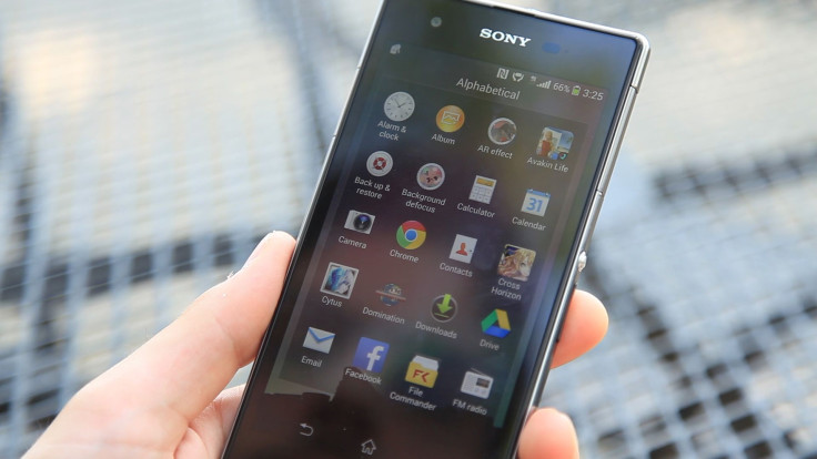
I’ll be straightforward: This is the best-looking phone I’ve seen since the Nokia Lumia Icon. The Xperia Z1S' frame comes in black or silver chrome, and most of its openings are tucked away, out of view. That, combined with its long, slim rectangular body, gives the Z1S an elegant, classy look.
This is a big phone --it's nearly six inches long. As such it can be a bit unwieldy if you have small hands, but the same observation holds true throughout the entire 5 inch+ class of smartphones these days. But unique to the Z1S is the giant bezel surrounding Sony’s Triluminos display - and it’s the biggest reason for the Z1S’s extraordinary length.
I had the same complaint about Sony’s Xperia Z2 tablet, but it doesn’t look like this aesthetic is going away anytime soon. But this more than just a style criticism -- the thick bezel on the Z1S makes the display look much smaller than it actually is. A touchscreen device always looks best when it maximizes its “face space;” the greater the percentage of the fascia that a display occupies in relation to a rim or bezel, the larger the display looks.
Maybe Sony’s done this to fit some electronic bits underneath the surface. It could be ignored if Sony had utilized the bottom bezel for at least a home button. Instead, it’s just good for collecting fingerprints.
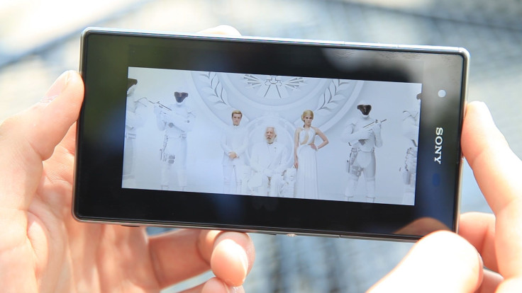
If you look past that, you'll notice the most important part of the face -- the screen. It’s one of its Triluminos units, the same kind seen on the Z2 tablet. The display produces a very soft, gentle image, which kind of fits the whole unobtrusive motif Sony has going on here. Personally, it’s a welcome change from the super-contrasting, super-sharp displays other phones have.
The Xperia Z1S only has three buttons to press -- power/lock, volume and shutter -- and they’re all on the right side of the phone. Sony cleverly placed the power and volume buttons at the equator - if you’re right handed, your thumb will naturally fall to the two switches, making the Z1S natural to use. For lefties, your thumb and middle fingers will be doing the work.
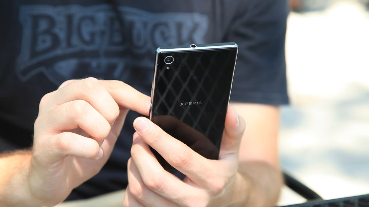
The independent shutter is a nice touch, and it’s placed far enough away from the other buttons that you won’t likely hit it by accident. The downside, though, is that it requires a bit too much effort to depress when you’re shooting photos in landscape mode. There’s always the on-screen shutter too.
PERFORMANCE
The Xperia line has Sony’s best offerings, so the Z1S’ spec list doesn’t disappoint. Two gigs of RAM, a 2.2 gigahertz quad-core processor, and 32 gigs of internal storage. There’s a micro SD slot for good measure. The Z1S is always quick and on point, whether you’re screwing around on Twitter or playing more intensive games.
The phone comes with Sony’s skinned version of Android 4.3, as you’d expect -- and official updates to 4.4 should be available relatively soon, if KitKat is more your thing. But as it stands, Sony’s interface is unobtrusive -- it lets you go about your normal business without shoving Sony apps in your face if you don’t want them. Honestly, you could be very happy with the stock interface, but there's always Nova Launcher or Cyanogenmod if you're feeling creative.
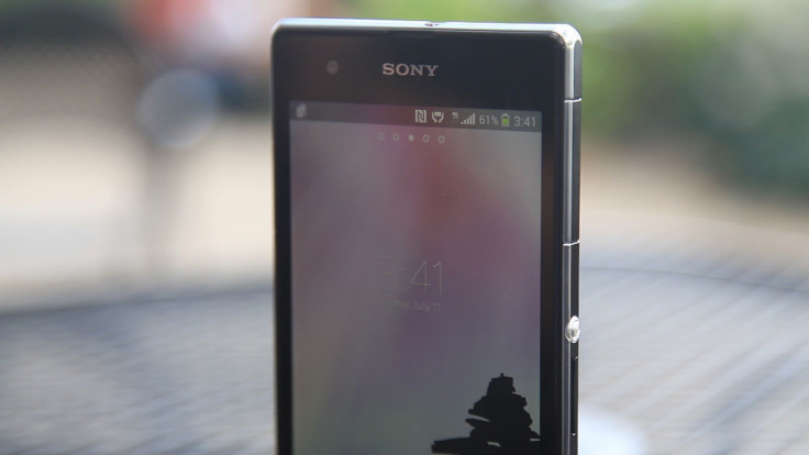
Battery life from the 3000 mAH unit is excellent-- normal duty netted nearly three days of uptime. If you’re the kind of person who leaves their phone unchecked for days, the Z1S will easily hold a charge for a week.
There’s only one drawback to the Z1S’s performance -- it’s a T-Mobile exclusive. I can’t say T-Mobile has a bad network, because I live in New York City, and let’s be honest, even Boost Mobile does fine here. But locking a phone to one carrier always adds a caveat to my recommendation, no matter how many users the network has.
AUXILIARIES
Now, the best part -- the camera. The Z1S’s camera app is damn quick, following your jerky movements with the greatest of ease. It even does well during 1080 video recording. Sony slapped a 20.7 megapixel camera in the Z1S -- and it shows. Outdoor photos are gorgeous and crisp, though the auto white balance does have some trouble, especially with loud colors. Still, a little bit of tinkering will go a long way here, particularly if you delve into the AR (augmented reality) effects.

The camera app itself is also quite nice -- Sony’s put its digital stability tech into the Z1S, which helps correct a slightly shaky hand, but there’s also a variety of digital apps within the camera app.
VERDICT
If you’re a T-Mobile customer, the Sony Xperia Z1S gives you another Android alternative to the mainstream heavy hitters like the iPhone, Galaxy S5 and HTC One. It’s a great phone with streamlined software, but Sony doesn’t have the same ranking in the smartphone world as the big boys. But if the Z1S strikes your fancy, it won’t be a bad choice.
© Copyright IBTimes 2024. All rights reserved.


