Apple iPhone Sales: The Real Numbers Behind Tim Cook's Misleading Chart Displayed At The iPhone 5S, 5C Unveiling
Apple Inc. (NASDAQ:AAPL) once again monopolized the attention of the tech community Tuesday with a media event that unveiled two new smartphones, the iPhone 5S and the iPhone 5C.
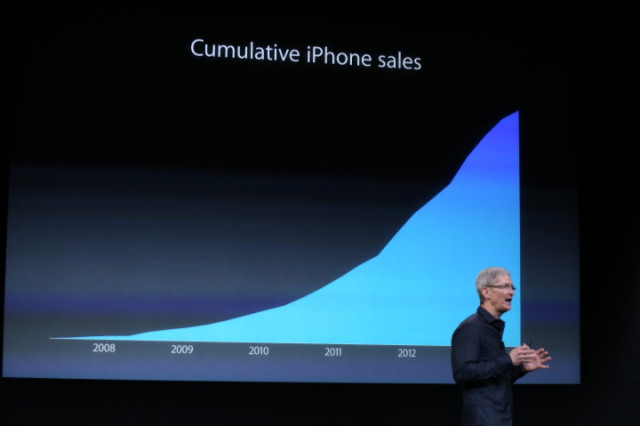
Before the big reveals, Apple CEO Tim Cook took some time to boast about increasing iPhone sales around the world. Cook said the iPhone 5 had the most successful first year of any Apple iPhone, and he showed a chart to demonstrate how successful the iPhone line of smartphones has been for Apple.

An impressive curve, for sure, but take another look. It shows time, but what exactly is the chart demonstrating? There is no scale, meaning the chart could be showing millions of iPhone sales as easily as it could be showing hundreds of iPhone sales.
The chart actually shows cumulative iPhone sales, which is misleading for several reasons. First, many of those iPhones are a replacement of an older or broken iPhone, meaning Apple hasn’t added a new user. Additionally, the chart doesn’t indicate how many users have left Apple for a competing smartphone brand.
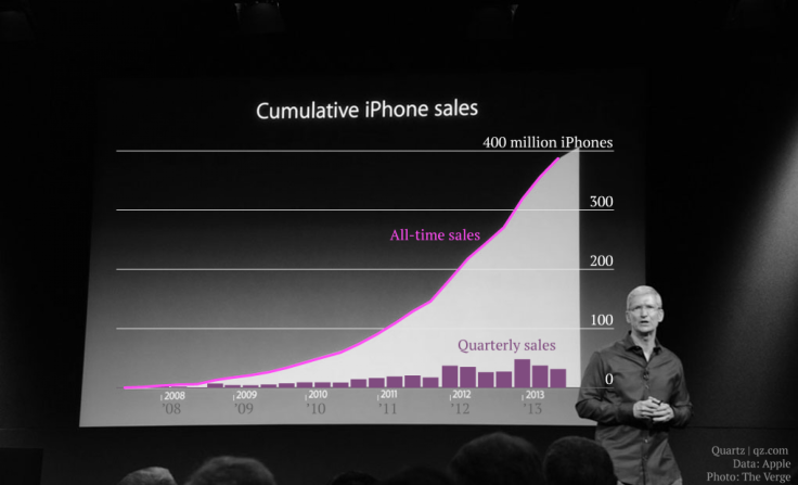
So what should a chart of iPhone sales look like? Quartz used data from Apple’s recent earnings report to make Cook’s slide a bit more informative.

As the chart shows, quarterly sales of the iPhone have declined over the previous quarters. It is worth noting, however, that Apple sold 31.2 million iPhones in Q3 2013, which is up from 26 million in the year-ago quarter.
The chart is at best a data visualization failure. At worst, it’s very misleading about Apple’s sales situation.
The stock market was not fooled. After the event, Apple shares fell nearly 2 percent to close at $494. In pre-marketing trading Wednesday morning, stock fell another 5 percent to close at $467, with analysts citing investor disappointment in the iPhone 5C as a primary reason.
© Copyright IBTimes 2024. All rights reserved.


