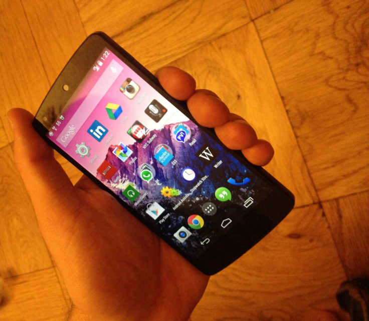
Google Nexus 5 Review: Initial Impressions Of Android 4.4 KitKat And The LG Flagship
Hands-on review: Google teams up once again with LG for the Nexus 5, featuring Android 4.4 KitKat

The Nexus program is a way for Google (NASDAQ:GOOG) to showcase the Android operating system stripped to its core, as well as to press its hardware partners into offering the best possible experience to customers. Google has teamed up with LG for the second time in a row with the Nexus 5, following the successful launch of the Nexus 4.
The “5” in Nexus 5 refers to the size of the device’s screen, which comes in at 4.95-inches. I was looking forward to the full HD (1080p) experience, having personally owned and used (and broken) not one, but two Nexus 4 models. I am notorious for being careless with my smartphones, but found that glass breaks on the Nexus 4 were relatively common on both the front and rear of the device.
Whereas the Nexus 4 featured Gorilla Glass 2 with a lower cost glass on its back, the Nexus 5 is upgraded to Gorilla Glass 3, replacing the glass back with matte plastic. In doing so, Google and LG were able to lower the weight of the Nexus 5 while increasing its size.
Luckily for users not interested in a full-size phablet, the Nexus 5 is a half-inch shorter and 0.4-inches thinner than the Samsung Galaxy Note 3. It is pretty close in size to the Nexus 4 while offering a larger screen. As gorgeous and bright as the Nexus 5 is, and as sharp as apps, text and video look in 445 pixels per inch (much higher than the 326 ppi iPhone 5S), I find it disappointing to hold.

Perhaps I was expecting a miracle in the Nexus 5, but it feels a lot bigger in my hands than the 4. The soft-touch rubberized sides of the 4 are replaced by glossy plastic, and while the ceramic buttons feel absolutely fantastic, overall it feels like a downgrade in materials.
The rounded back lacks the ergonomic curve found in phones like the Moto X and HTC One, which is disappointing, as those phones feel great in hand. To be honest, I always preferred the sleek, flat surface of the Nexus 4, and feel like the Nexus 5 has a bit of an identity crisis between flat and rounded.
Physically, the Nexus 5 reminds me of the LG G2, and not in a good way. At least Google kept LG from placing the Nexus 5's buttons on its back cover, which I found unnatural and uncomfortable on the G2.
So far, very little of the upgrade to Android 4.4 feels like much of an improvement. Google Hangouts has replaced a standard text messaging app, and it is certainly an awkward fit at first, and opens slower than the Messaging app on my Nexus 4 -- despite the advanced hardware found in the Nexus 5. The dialer has also been changed, and it will probably take me a little more time to get used to it. I will do just that before I decide whether it makes voice calling on the Nexus 5 easier, faster or more intuitive.
The screen of the Nexus 5 has a higher resolution and appears much brighter than the 4. Google’s voice search is always listening from the Nexus 5 home screen. These factors have a serious impact on the battery life of the Nexus 5 -- so far, it eats up about 15-20 percent of battery life in less than an hour of basic usage.
Photos look great on the Nexus 5 -- optical image stabilization (OIS) at work. Essentially, the Nexus 5’s camera is on a spring to reduce the effects of jittery hands and motion.
Despite the advanced hardware and incredible value of the Nexus 5, I am so far unimpressed with it. Look for a more in-depth review next weekend after I run the Nexus 5 through the gauntlet of a full week's usage.
© Copyright IBTimes 2024. All rights reserved.


