How To Get Google Calendar's New Look With The Latest Redesign

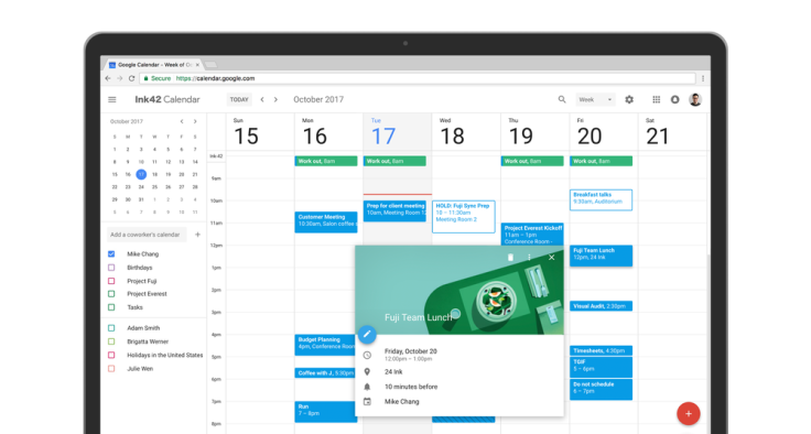
Upon opening up your Google Calendar today you might have noticed the new look that launched on the app. Not only was it redesigned with a new look but it has a few new features as well.
The new calendar has a sleek new look that resembles the mobile app. The responsive design adjusts to the user’s screen size and has a more sleek feel, according to a post on Google’s blog from Google Calendar Product Manager, Lars Krüger. The updates were partially inspired by users who have made suggestions about improvements they wanted to see happen.
Check out our new look and fresh features → https://t.co/EmGm6Tt4Jb pic.twitter.com/Almcfn9haR
— Google Calendar (@googlecalendar) October 17, 2017
Among the new look, there are some changes to the app that are aimed at improving its usability. Now users can see more information about conference rooms when booking a room, if the administrators of the Google Suite have added details. The details they can add include room size, its location, what sort of accessibility it has and more. To see this information users just have to hover over the name of the room in Calendar when looking to book a room.
The new Calendar updates also allow users to make their invites more comprehensive with links and documents. Not only can users now add their Google Doc presentations, spreadsheets or documents, they can easily access them from the “Event Detail” view of the invite.
Aside from viewing their own personal calendar over a day or week’s time users can now view multiple user calendars on a given day making the job of someone who manages multiple calendars far easier. This can especially come in handy for anyone trying to schedule a meeting for multiple people with busy schedules. There are a few other features like one that allows users to see the contact information for those invited to an event or one that allows users to restore deleted items.
There are a few different roll-out options for the new Calendar. If you want the sleek new design you might need to speak with the administrator of your company’s email server. If you want it on your personal account you simply have to select “Use new Calendar” in the upper right corner of Calendar.
Administrators on the other hand have to take a few more steps to get the new Calendar. One option is to just wait. The new Calendar is scheduled to automatically roll out Nov. 14 for Rapid Release domains and on Nov. 28 for Scheduled Release domains, according to a Google blog post. The transition for all users will then take up to eight weeks.
The second option is to manually update to the new Calendar, this is particularly helpful if there’s an extension that’s vital to the work a company does but that isn’t supported yet with the update. To update manually simple select "Apps" and then "G Suite" followed by "Calendar" and "New Calendar." There the admin can choose when users should have access to the new design. But come Feb. 28, 2018 all users will be switched over.
© Copyright IBTimes 2024. All rights reserved.


