iOS 9 Preview: The 4 Worst Features Apple Should Fix Now

I'll preface this by saying that I’m a fan of Apple's iOS 9 on the iPhone and iPad so far. It’s only a beta, but it’s fast, makes some great changes, and has some cool battery-life features that solve some of iOS’ biggest issues… but there’s one or two things that don’t quite sit right. It’s not an iOS 7-style seismic change, but it’s not the near-silent update OS X Snow Leopard was for the Mac.
iOS 9 is still in beta, so I’ll avoid criticizing bugs or small features that are likely to change before release. Nonetheless, there are still some irritating quirks that are unlikely to change with only a few months to go until the software is finally released.
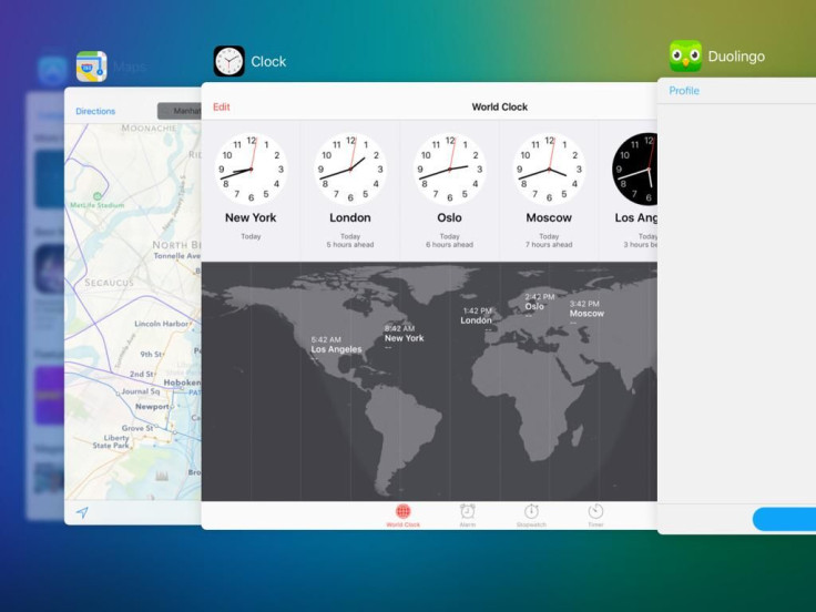
App Switcher
The old app switcher was great. Simple, flat, sleek -- it matched with iOS 7 and 8’s new design well. Now we have some ghastly 3D swirling thing that resembles Windows Vista’s Flip3D monstrosity. What happened?
The new app switcher is a joke. You lose the fast-scrolling capabilities from the old switcher, there’s some awful layering effects going on that are headache-inducing, and it’s actually harder to see what the app is because the app in front of it slightly layers over it first. A beautiful, simple switching tool is gone. And this meddling has resulted in a second casualty.
Reversed App Swipe Direction
iPad users who’ve stuck with the device since iOS 5 will probably realize that you can swipe with four fingers to change apps. Pretty great, right? But now Apple has decided that swiping left was way too simple, and switched the whole thing around. To get back to your last app, you now have to swipe right.
Why? Well, thanks to the first point, the app switcher now slides in reverse, so the behaviors have seemingly been switched to mimic the new switching animations. We'll just have to get used to it.

Good News, Bad News
News looks great. I can see it fast becoming the first thing I check in the morning. It also reminds me of why I stopped using RSS feeds in the first place. When an outlet supports News, it looks awesome, but when it doesn’t, Apple will depend on the RSS feed to provide the content. And that’s where it all goes downhill.
A lot of outlets want you to click on a hyperlink to continue reading the story. It interrupts the reading experience, slows down the loading pace, and crucially, renders the story useless when reading offline. What’s the point? I might as well go to the website in the first place. This will only get better when publishers change their output, but some of them may never switch.
Multitasking Interface
iOS 9 has a cool new multitasking feature for iPads where you can overlay one app on top of another and carry out small tasks before you jump back. There’s just one problem: The secondary app switcher, activated by swiping down from the top of the multitasking pane, is clunky. It’s just a big list of the most recent apps used in multitasking. That’s fine for an app switcher, but as more apps update to support multitasking, that list is only going to get longer and longer.
There’s no search bar, no easy way to scroll quicker, and no easy way to reach the top of the list. Again, fine for an app switcher, but this isn’t just an app switcher. It’s a mini homescreen used for picking an initial multitasking app, and it really needs to act like one. Apple can make small changes between now and release to make scrolling easier, but the radical redesign needed here is almost certainly not going to arrive in time.
© Copyright IBTimes 2024. All rights reserved.


