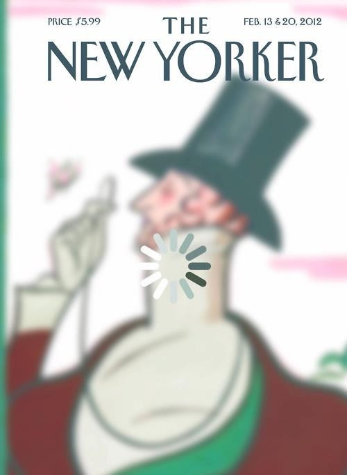
New Yorker Cover is ‘Loading…,’ First Time Designed by Reader

Magazines publishers have largely struggled to adjust to the incessant content creation and immediacy of the internet age. Of the few legacy brands that have survived, even fewer remain culturally relevant. An exceptional carousel of writers and a tiny congregation (in comparison to the breadth of the internet) of deeply devoted readers keep these few publications afloat while most other dated media companies continue to crumble.
With the demise of the magazine industry underway, it's no wonder that The New Yorker, one of the most respected brands in the publishing industry, has finally used a reader-submitted design as inspiration for the front cover.
This marks the first time that a reader's design has influenced the cover of the magazine. The design isn't exactly what was originally submitted. The final cover of The New Yorker is a blurry image of Eustace Tilley, the magazine's famous mascot, in front of which is a loading sign snagged from a loading YouTube video.
In the original design, which was created by a thirty-year-old landscape historian named Brett Culbert, the loading sign replaced the butterfly from the very first cover of The New Yorker in 1925. Designers at The New Yorker brushed up the design and slapped it on the cover.
The company selected 12 designs created by readers as part of a series called Your Eustace. The magazine collects submissions of Eustace Tilley annually to mark the anniversary of the magazine. View all the submissions over at The New Yorker website by clicking here.
© Copyright IBTimes 2024. All rights reserved.


