Pandora Gets HTML5 Makeover

Pandora, the streaming music playlist service, is getting a new HTML5 design that will be sleeker and much faster.
The new version will drop its Flash design for more functionality, replacing it with the quick and versatile new code language. Pandora boasts that the HTML5 site will have a better user interface and allow Pandora fans to share songs and playlists more easily.
We wanted the experience to be completely fresh. But we didn't want to force our listeners to completely re-learn the Pandora experience, Pandora's head of product and CTO, Tom Conrad told Tech Crunch. There are a bunch of great features on the new site, but we continue to be really committed to the idea that Pandora wants to be a simple solution.
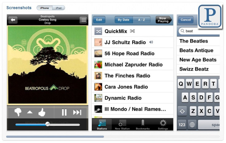
The enhanced Pandora will actually be more closely related to the company's iPhone and iPad applications than to the old version of the site. It will also display song lyrics and user comments, something Pandora did before, but not well.
HTML5 is the only technology that has a shot at being a ubiquitous solution across a wide range of computing experiences - tablets, TV, automobiles, etc. We still have along way to go, but it's possible, Conrad told the technology publication.
Pandora One subscribers will get first access to the new site on Tuesday, and normal users will see the new service in following weeks. All users will soon be able to create their own profiles, like on any social networking site, to better share likes and dislikes with friends and followers.
© Copyright IBTimes 2024. All rights reserved.


