Pandora Redesigns Website, Adds New Features

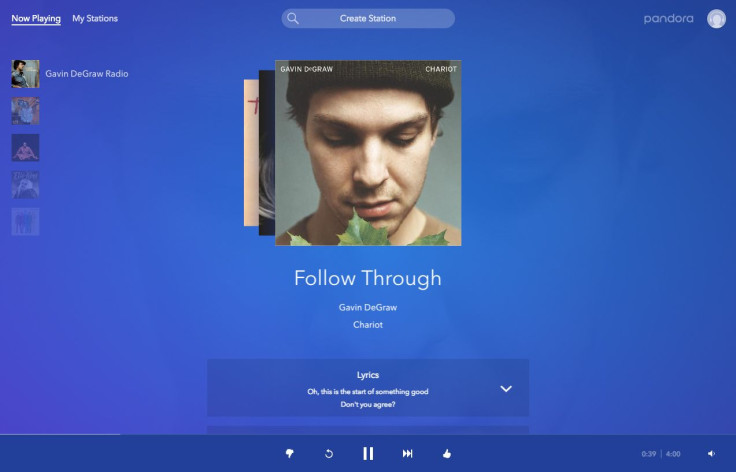
Pandora for the web was first released in 2011. Since then, Pandora for the web hasn’t received any major overhauls, that is until today. Compared to Pandora’s old design, the new design is a lot cleaner, features a fixed bar that shows what’s playing, improved navigation and integration with Ticketfly.
Pandora senior product manager Sunaina Gyani told TechCrunch, “Web is one of our primary platforms. We have a lot of very heavy web users. We wanted to make sure we were giving them an equally delightful experience.”
Now that the music player on Pandora’s web platform is now fixed, the bar at the bottom of the screen ensures users will never lose sight of what’s currently playing. The album artwork is also at the center of the screen and provides listeners with artist information such as tour dates, lyrics, bios and more. The new blue site also reflects that of the company’s logo and mobile app for iOS and Android.
Pandora’s navigation feature also makes it easier to create and organize station, look at favorite tracks and make use of playback controls. Pandora says the “updated features across the platform allow you to easily control your listening experience.”
Pandora Plus listeners can use restart the song from the beginning or find an old track to listen replay. If you’re on the ad-supported version of Pandora on the web offers the new features, but they are limited. If you happen to run out of skips, the company says that you can “watch a video to get those extra features for added control.”
© Copyright IBTimes 2024. All rights reserved.


