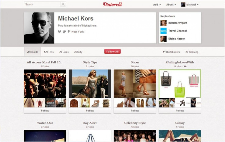
Pinterest Profile Design Updated: Do You Like The New Look?

In case you've been living under a rock for the past three months and missed the big news: Pinterest is quickly becoming one of the most important social networks in the country. Over the past few months, it's become one of the fastest growing social media websites in the U.S. -- recently being added to Hitwise's top five social networking sites -- and has been praised by several many social media gurus.
In the wake of recent success, Pinterest has introduced a new design for its users' profile pages.
Pinterest has revamped the design of its users’ profile pages in an attempt to help people discover media.
The new profile page design is a dramatic shift from the previous iteration that Pinterest used. Rather than taking an approach that emphasized column alignment (where profile pictures sit in the top left corner of a profile page), Pinterest has re-oriented the major design elements of the site. The new design emphasizes rows.
Across the top of the new profile page -- stretched horizontally -- is a person's bio description and links to all the sites they've attached to their account. Links to the accounts that a person has re-pinned images from are in the top right.
Ben Silbermann, CEO and co-founder of the company, alluded to the redesign in an interview at the South By Southwest festival in Austin, Texas: I'm so excited about it, said Silbermann. We wanted to make it more beautiful...to make your profile different in kind than the profile you have on Facebook.
Silbermann emphasized the importance of making it easy for users to discover media, according to a Mashable report. The young CEO wants to make the site easier for like-minded people to find each other on the network and also hopes to increase the type of media that can be pinned to a pinboard including video.
While waiting for expanded capabilities to be introduced to the social network, Pinterest users have a beautiful site to scroll through. In a similar fashion to the Facebook Timeline, Pinterest offers a seemingly never-ending scroll through content. The difference-maker for Pinterest is the emphasis on photos and short blurbs accompanying each photo. The photo-centric design seperates it from any other social network on the market.
Because it's images only, it takes the clutter of text and Web pages away, said Jennifer Levy, an interior designer in Brooklyn, during a CBS News report. She uses Pinterest to share designs with clients and also explores what other designers are doing.
Beautiful design elements have fueled an explosive user growth for Pinterest. CBS News reports that Pinterest grabbed 10 million monthly visitors faster than Facebook, Twitter or any other site tracked by comScore. The outstanding rate of growth is especially suprising for a network that launched in closed-beta in 2009.
What do you think of the redesign?
Are you a fan, or do you think Pinterest could have done better?
Sound off in the comments section.
© Copyright IBTimes 2024. All rights reserved.


