The World According To Goldman Sachs In 2013: Maps

Goldman Sachs Group Inc. (NYSE:GS) has compiled 100 charts that best depict its favorite investment and economic themes for 2013. Here are some maps from that report.
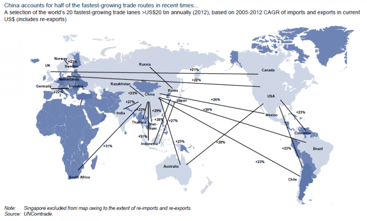
Fastest expanding channels in global trade, centered on China from 2005 to 2012:
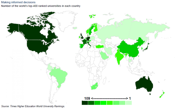
Concentration of the world’s top ranked universities, as measured by the Times Higher Education World University Rankings:
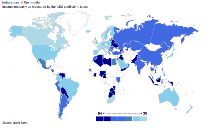
Global income inequality, according to the World Bank’s GINI coefficient.
(Note, though, that GINI coefficients for many countries haven’t been updated for years. The latest figure for the U.S. is from 2000. The darker the blue, the greater the income inequality.)
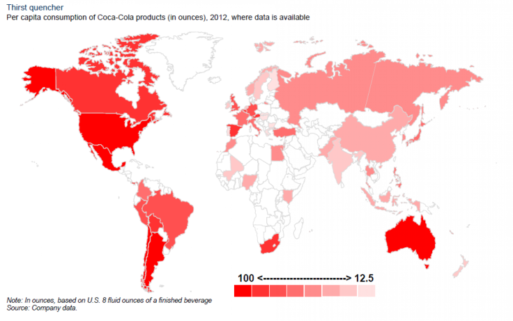
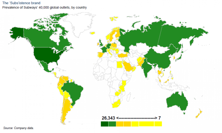
Next, who could forget two of the most popular consumer brands in the world? The Coca-Cola Company (NYSE:KO) is the largest soft drink seller in the world, while privately owned sandwich chain Subway is the most popular fast food brand in the world, by stores opened.
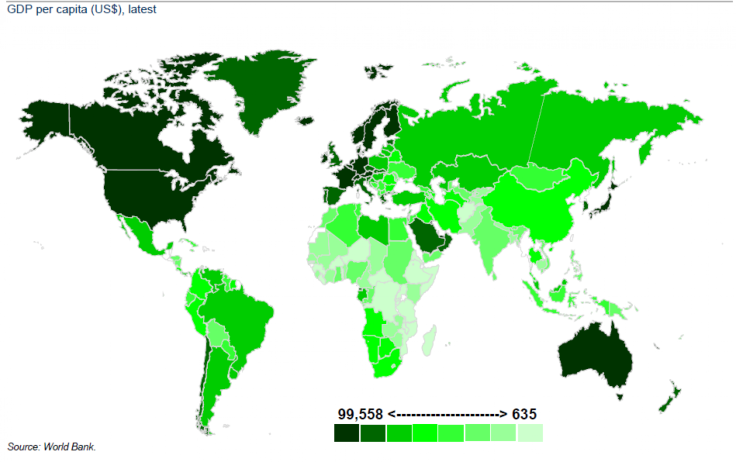
Lastly, for reference, a map of the world by gross domestic product, or the total of goods and services produced in that country, per capita.
© Copyright IBTimes 2024. All rights reserved.


