Microsoft Windows 10 Mobile Concept Design Shows How To Make The OS Standout

As of today, Microsoft has not rolled out the Windows 10 Mobile OS officially to eligible Lumia handsets. The expected release timeframe has been reported as “early 2016.” However, the new Lumia series, including Lumia 950, Lumia 950 XL and Lumia 550, come with Windows 10 on board. While we are waiting for the new OS to start rolling out to older Lumias, a designer at Behance has developed concepts to show how Microsoft’s latest software version can be great.
According to Brazilian UI/UX designer Robson Jobs, upon tweaking the Windows 10 Mobile, the OS could offer impressive user experience. The designer apparently used “Adobe Premiere Pro” and “Illustrator” to develop the concept, according to Neowin.
The design concept solves some of the well-known “defects” or rather “inconveniences” in the Windows 10 Mobile. Jobs has clearly explained the minor changes he had made to some sections of the OS in order to provide an overall boost to the firmware.

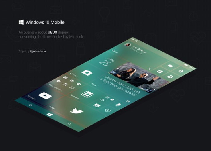
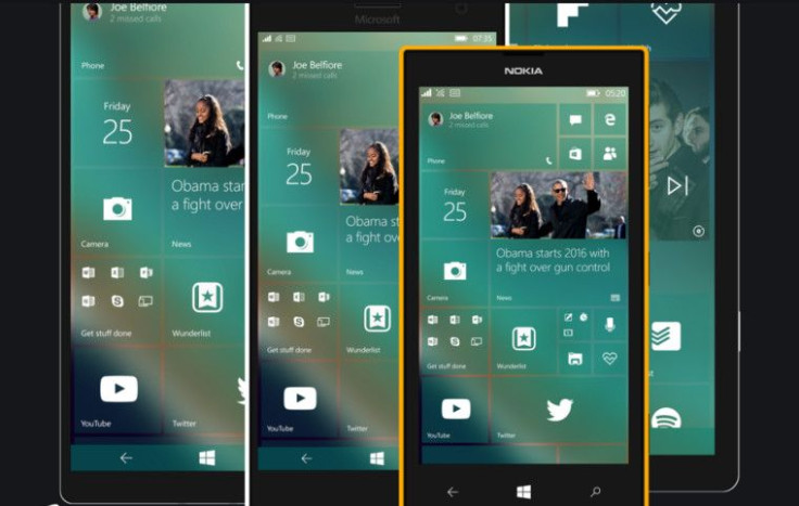
Small but significant modifications have been made to the “start screen.” This includes a new size (large) for live tiles. The tiles in this concept are interactive and transparent. Notably, the navigation bar is also transparent.
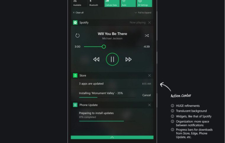
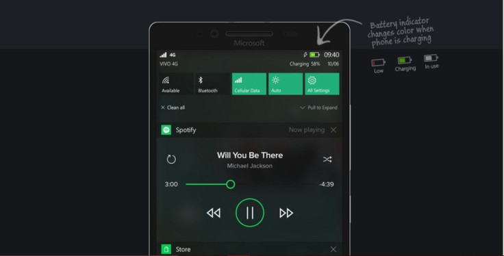
The lengthy text boxes, like the “search box” in the app list, have been substituted by an economical “search button” instead. The action center now has a translucent background, along with widgets and progress bars.

The Windows Store app, on the other hand, features a dark gray background color. Changes have also been made to the notification center, multitasking, hamburger menu, collection page and system themes. The spacing and arrangements have been optimized.

With many such tweaks, the overall appearance of the Windows 10 Mobile concept seems enhanced and refined. Interested readers can check out the complete set of proposed tweaks from Behance.
© Copyright IBTimes 2024. All rights reserved.


